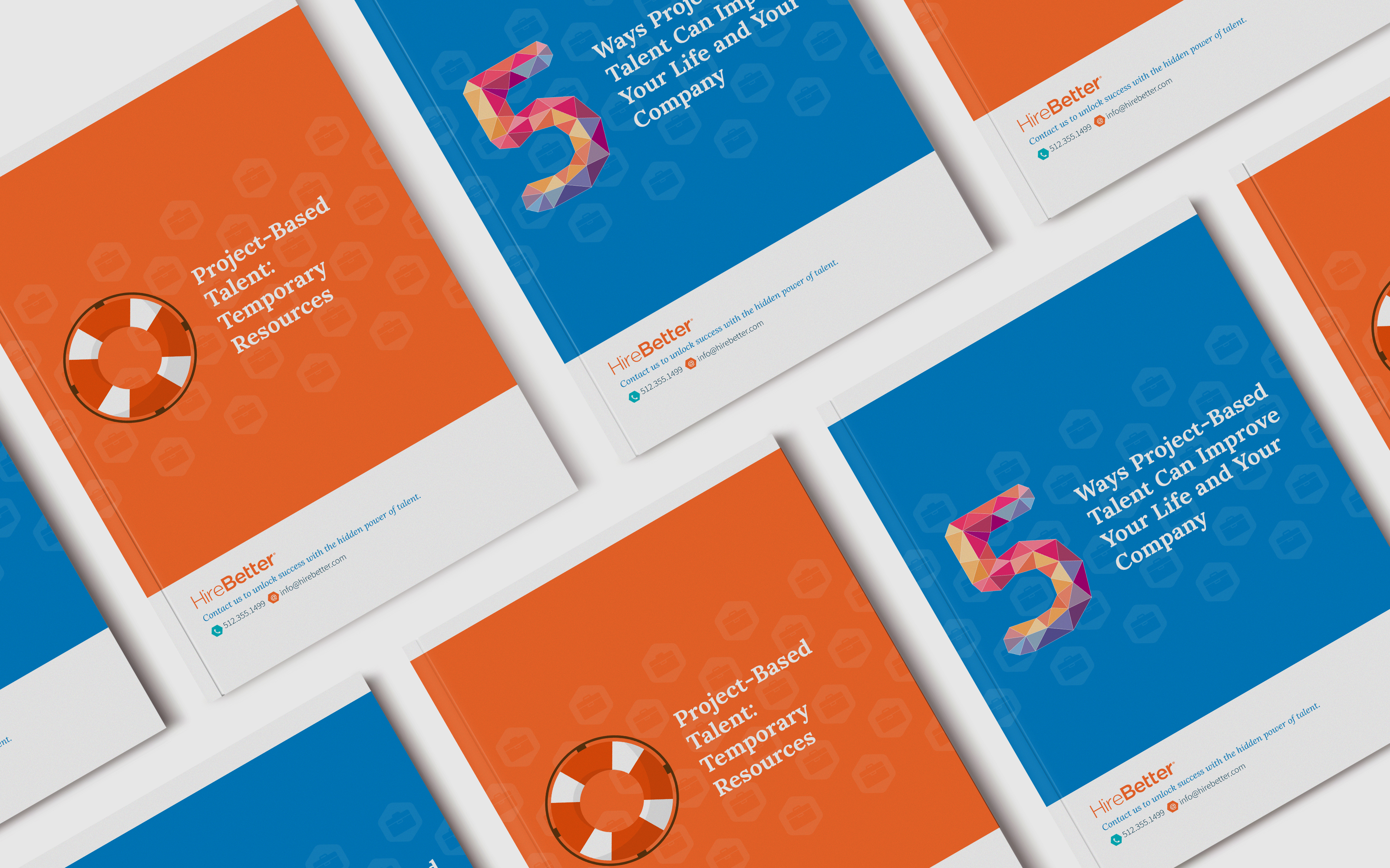
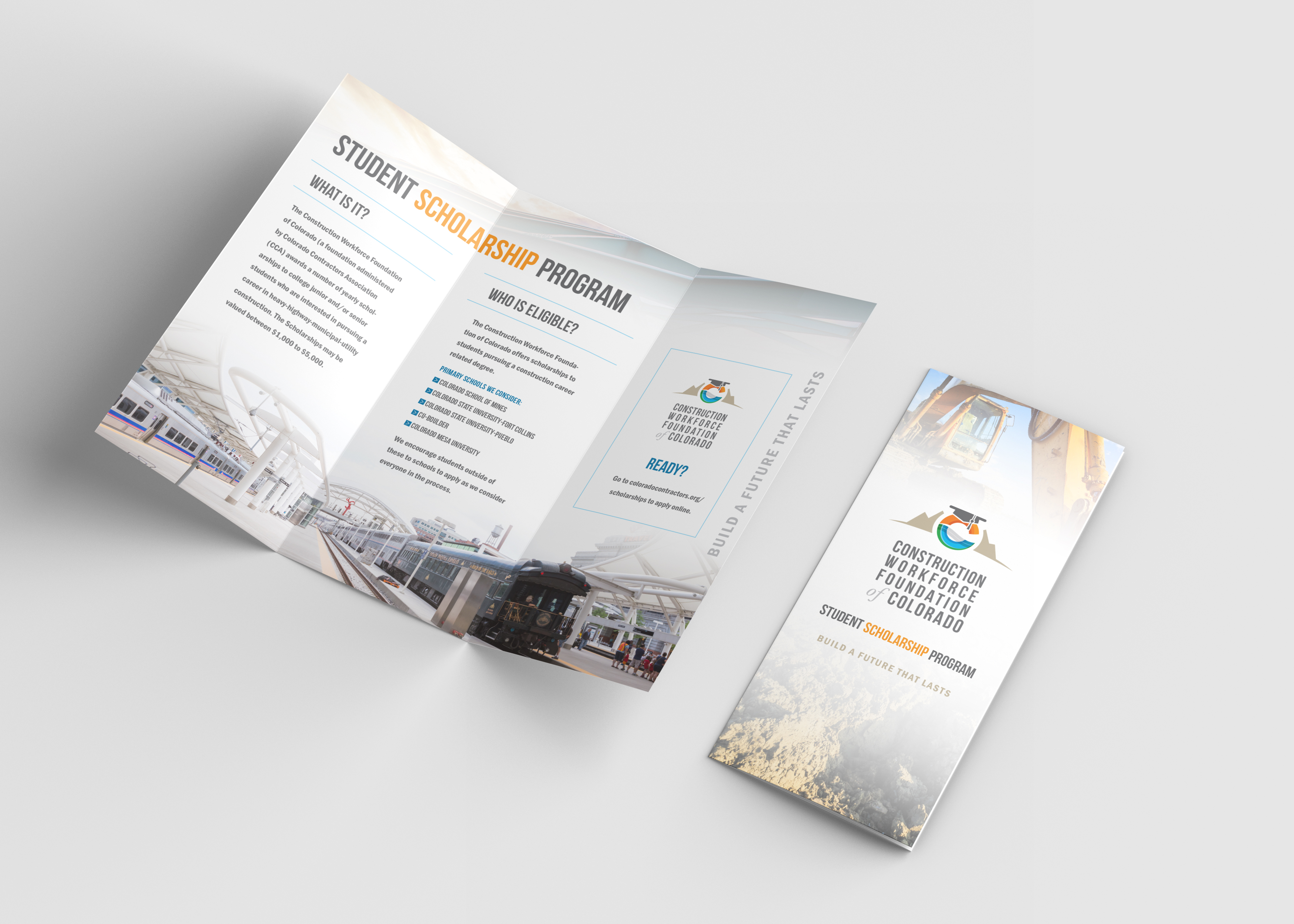
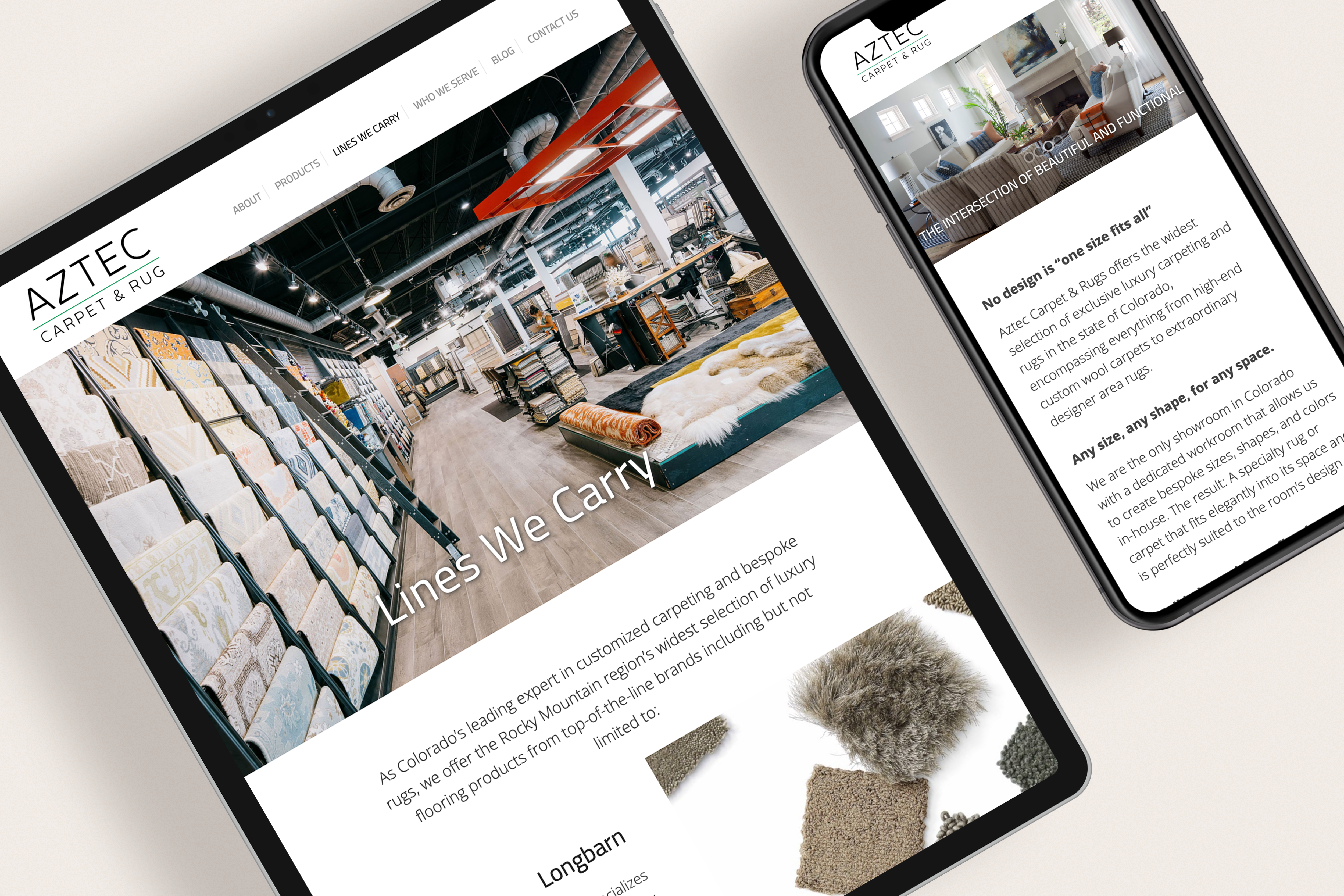
Meet our pride and joy. Our branding studio is here for aesthetically captivating, user-friendly designs. Whether it’s a logo, website, or print, the AGC creative team pours our heart and soul into every project — and it shows in the results. Check out some of our previous work and see for yourself!
Tiffany has been incredible to work with. Her attention to detail and ability to see the potential of each businesses design work is impressive.She is very committed to each project and puts her all into everything she does!I highly recommend!
Tiffany is fun to work with and very knowledgable. She is a great resource for website design and expanding functionality on existing sites. I highly recommend, "A Girl Creative"!
Tiffany at A Girl Creative Design studio created a stunning website for my business that has truly improved not only the branding of my business, but the functionality of my business online. Her artistic approach to design shows her understanding of how to present the nature of a company. Not only does she have great design skills, but she was able to make my website function in a way that has greatly improved and reduced the time I have to spend on administrative tasks. I highly recommend A Girl Creative for all of your website needs!
To provide the best experiences, we use technologies like cookies to store and/or access device information. Consenting to these technologies will allow us to process data such as browsing behavior or unique IDs on this site. Not consenting or withdrawing consent, may adversely affect certain features and functions.
Functional
Always active
The technical storage or access is strictly necessary for the legitimate purpose of enabling the use of a specific service explicitly requested by the subscriber or user, or for the sole purpose of carrying out the transmission of a communication over an electronic communications network.
Preferences
The technical storage or access is necessary for the legitimate purpose of storing preferences that are not requested by the subscriber or user.
Statistics
The technical storage or access that is used exclusively for statistical purposes.The technical storage or access that is used exclusively for anonymous statistical purposes. Without a subpoena, voluntary compliance on the part of your Internet Service Provider, or additional records from a third party, information stored or retrieved for this purpose alone cannot usually be used to identify you.
Marketing
The technical storage or access is required to create user profiles to send advertising, or to track the user on a website or across several websites for similar marketing purposes.


